Posts in category 'Company News'
Subscribe and receive email notifications of new blog posts.
 RSS Feed
15
Doing what's right for you, in your market.
You deserve leadership that makes decisions based on what's right for you in this market, not from a boardroom across the country.
During a period when many brokerages are consolidating under corporate interests, we're proud to remain fiercely local and independent. Our reasoning is simple — it's what's best for our business, our agents, and the markets we serve.
For over 170 years, we've been the oldest and largest independent brokerage in Chicagoland, and that independence means we have local control — our agents have the resources they need right here in Chicagoland. From office staff to the top leadership, they get real support from people who truly understand our communities and what it's like to do business here.
Whether we're unveiling a new brand, launching innovative tech, building a new in-hou...
5
Your choice matters — here, you're in charge of your business.
With more than two decades of residential real estate experience and over $500 million in transaction volume, Cummins has found his new home here at Baird & Warner. His decision came down to a few simple reasons — independence, integrity, and what he sees as a golden opportunity to join a brokerage that is focused on doing things the right way.
"In today's marketplace, corporate-owned brokerages control much of the market, which invites unfair practices and leaves consumers at a disadvantage," said Cummins. "I've always believed in fair housing and an open market, and I've been outspoken in my opposition to practices like private office-exclusive listings, which I find fundamentally at odds with transparency."
Cummins continued, emphasizing how today's real estate market is more challenging than ever for buyers — but that it doesn't always have to be th...
30
Introducing Image Services
We're thrilled to announce the launch of our new in-house Image Services division, which will deliver high-impact visual marketing solutions for Baird & Warner agents and clients.
Our new Image Services division will be led by Shannon Lange, former area sales and account manager for VHT Studios and Matterport, where she worked with the region's largest brokerages. It will offer professional photography, immersive 3D virtual tours, floor plans, videography, and aerial drone footage, all designed to help agents attract more buyers, sell properties faster, and strengthen their personal brands.
"With the sudden closure of VHT Studios, we saw an opportunity to do what we do best: innovate and build an in-house capability that not only maintains, but enhances the marketing tools available to our agents and customers," said Laura Ellis, chief strategy officer an...
27
A new era of independent brokerage has arrived.
We are pleased to announce that fellow independent brokerage, Dream Town, will become part of the Baird & Warner family. As a combined entity, we will now be the second-largest brokerage in the region, representing nearly 3,000 agents, loan officers, and staff providing comprehensive real estate services throughout eight city offices and a total of more than 30 locations across Chicagoland.
Throughout our 170-year history, we have sought to pursue strategic partnerships that enhance the value we bring to our agents and clients, strengthen our position, and sharpen our competitive edge. This expansion of the Baird & Warner family makes it the place for estate professionals who prioritize an agent-centric culture that is driven by support and focused intently on their success.
"We quickly realized that our shared values, service offerings, and technology woul...
22
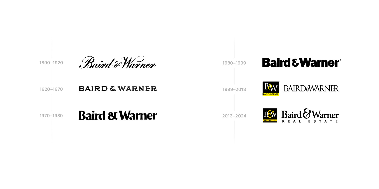
Breaking out of the box: the Baird & Warner brand evolution.
In 2024, Baird & Warner introduced its first new brand in four decades. We sat down with the chief marketing officer of Baird & Warner, Peter Papakyriacou, to learn about the motivations, inspirations and goals of the new look.
Keep reading to hear what Peter had to say, and check out the full conversation on our rebrand below.
So, what motivated Baird & Warner to launch a refreshed brand identity after nearly 50 years?
This rebrand has been in the works for a while. When I joined the company 14 years ago, I made an effort to consolidate several brand variations into a much more streamlined, singular brand, which served us successfully for many years. However, as we continued listening to agents and managers and their feedback, it became clear that it was time to evolve the brand for today and the future.
The biggest notable change was in the logo. Can you tell us about that?
We had had the boxed B&W logo for nearly the first thing we wanted to do was break out of the box — literally and figuratively. We had been using the square boxy logo for decades, and it had limitations. We wanted a logo that felt like an evolution, so we kept the ampersand but went back to our full name instead of the B&W and pulled away the constraints of the box. Now we can incorporate the logo more seamlessly into all types of marketing and design. It also allowed us to represent the full breadth of our service by including the mortgage, Title, Sales, and Insurance in the logo lockup.
What was the intention going into this new brand?
First and foremost, the purpose of this new brand was to support our agents' business. One of the core reasons to go through this rebrand was to get back to the name Baird & Warner in our logo. For more than 20 years, our primary symbol has been the B&W acronym, but we don't go by B&W — we go by Baird & Warner. That's where we have our brand equity, and that's the Baird family name that has stood the test of time. So it was important to bring that back to ensure we're presenting a unified identity and tapping into that brand awareness that exists in the market.

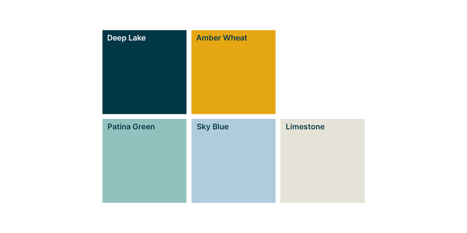
As you mentioned, the Baird & Warner colors for a long time were black and yellow, but that shifted with the rebrand. Can you speak to the inspiration for those new colors and other elements of the brand?
Yes, our new colors are Deep Lake, a slate blue color, and Amber Wheat, which is an evolution of the yellow we had before. The color palette is meant to be emotive and elevated while giving a nod to our legacy as a 170+ year old Chicagoland company. Deep Lake, a reference to Lake Michigan, represents the vast resources we provide to agents — coaching, marketing, training, and all the person-to-person support. Amber Wheat is all about those Midwestern values and our ethics, our resilience as a company.
Along with those colors, we have an expanded secondary palette that gives agents an opportunity to find a balance between the brokerage brand and their own personal branding they may have.
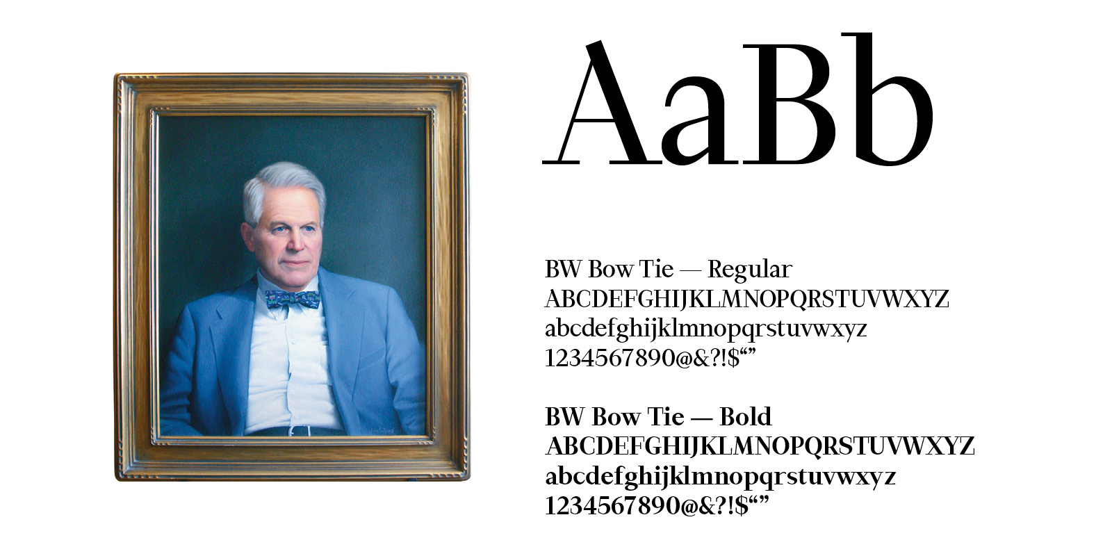
There are some other little hidden references in the brand that speak to our company and history. Can you tell us about those?
Yes, we have an amazing company archive at Baird & Warner, and so we spent the better part of a couple of years digging into our 170 years of history and uncovering a treasure trove of symbols, logos and design elements that we wanted to try and incorporate into the rebrand while still keeping it modern and sophisticated.
One element is the custom font we called BW Bow Tie, which honors the late John Baird, who was the former president of the company and the father of current CEO Steve Baird. He was very beloved and was a true embodiment of the values we believe in at the company, and we wanted to honor him in some way. The reason we called it Bowtie was because he was known for always wearing a bowtie — it was his signature look.
We also created unique patterns and icons that provide a more robust library of design elements that can be used across our marketing and merchandise. The woven Bs and Ws for our name, as well as a refreshed version of an old logo that we call the Baird & Warner Seal, lend themselves to sophisticated wearable items such as a scarf, tie, or pins. 

How do you see this brand fitting into the agent's businesses? What has been the response?
This brand should exist as a complement to their own brand. Most of our agents who have a personal brand have embraced the new identity. They feel it reflects their high level of sophistication, service, and expertise. And they also feel it gives their clients an aspirational element in their real estate journey. As mentioned before, they are particularly fond of the new color palette and the patterns we've introduced, as they provide an elevated, luxury element to the brand.
As with any complete rebrand, there is always a risk of missing the mark. Thankfully, our agents have overwhelmingly adopted the new logo and its elements. And more importantly, reported several success stories where it helped them stand out.
Visit joinbw.com to learn more about how we help our agents succeed.
AWARD WINNING SERVICES
GLOBAL REACH & HOME INSURANCE

WEBSITE AWARDS


Market Report
Sign up today to stay updated on what’s happening in your local real estate market.